
Is Your Church’s Annual Report Appealing?
CommunicationThe topic of an annual report isn’t a new one for my blog. We’ve talked about it before (and even before that). But I want to talk today about something I haven’t hit on all that much before – the appearance of your church’s annual report.
To many lead pastors, executive pastors, and business administrators, this may sound odd. But it’s important to see your annual report through the eyes of your givers.
I’ve said it before, and it may sound cliche, but it’s the truth. Photos and videos evoke heart-level emotion. And that’s right where you need to be. More importantly, when people see an annual report that is visually appealing and intriguing, they’re much more likely to read it and much less likely to discard it.
We learn best from real life examples, so let’s take a quick look at a before-and-after annual report makeover. Here’s what a client church recently compiled to send out as a year-in-review annual report (after I redacted church and pastor names):
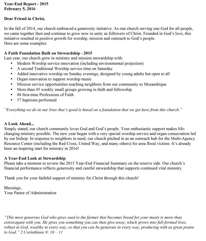
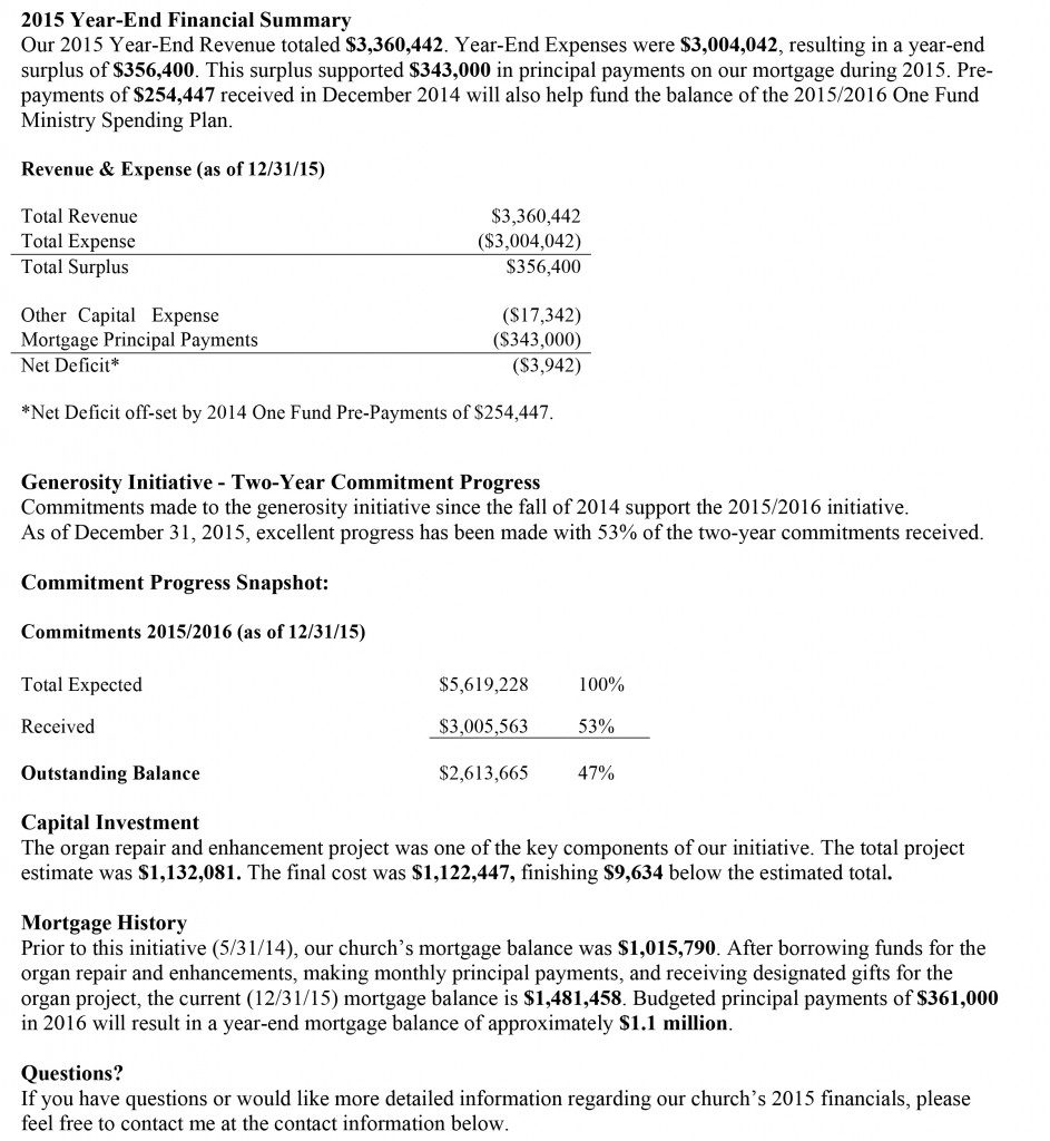
Now, please know there’s nothing inherently wrong with this. In fact, the information they want to share is completely spot on – 2015 financial summary, baptism numbers, generosity initiative project updates, a letter from the pastor… this is all excellent. But to see it, it’s simply not visually appealing. For someone who might not be a “reader”, or inclined to digest numbers, they’re likely to not read the content.
Here’s a spread of several pages from the finished product after the church leadership opted to add some graphic design elements, infographics, and photos to bring this information to life for their people.
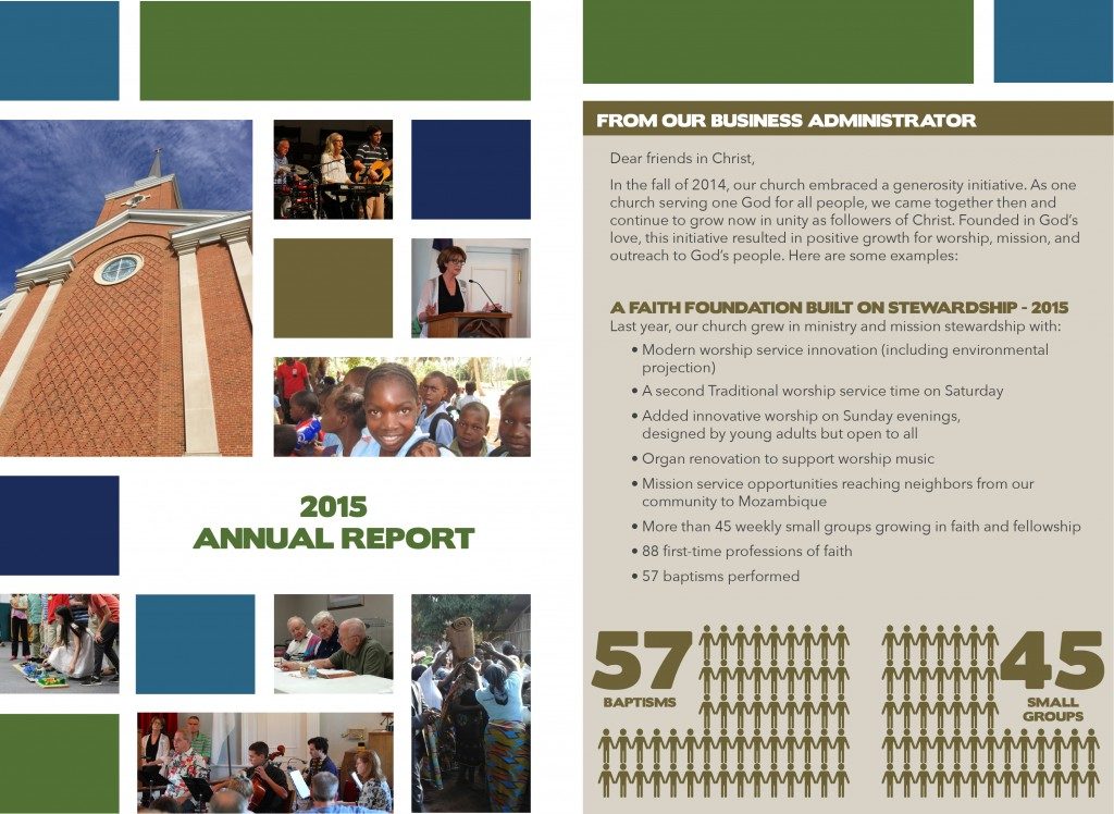
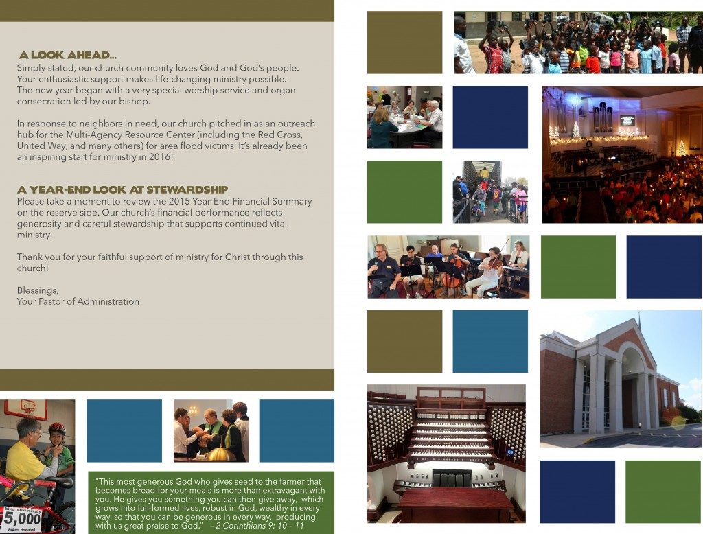
Which one would you pick up and read?? What an amazing difference! I guarantee you the people being given this new and updated handout were more interested in reading it. And that’s what we want – to draw people in to learn more about God’s amazing work when we give.
Visually appealing reports draw people in to learn more about how our giving funds God's amazing work. Click To TweetHere is another example I’ve shared before that will really drive home the point of having a visually appealing and intriguing annual report:
You may have noticed in each of these two samples, both of the web pages contain information about the annual report, a video to watch, and a place to download the actual report itself. So in case you’re wondering, you don’t have to print your annual report. You could create the report as a video like I’ve mentioned before. Or create a design on your website itself like these two churches did. It’s up to you, but your people deserve an annual report that is visually appealing to help encourage them.
Looking for what to do once you’ve completed your annual report? Check my blog post from last year on this topic.
Looking for more personalized annual report help? Just reach out and I’d be happy to help you!
About Rusty Lewis
As a church leader, there’s nothing more frustrating than not having the funding to do what God’s calling you to do. But when you think about trying to address that problem, you feel overwhelmed, you dread the potential pushback from your congregation, and you’re not sure where to turn for help. Over the last 18 years, I’ve helped more than 120 churches close the gap between their current financial reality and what they need to move forward in ministry.